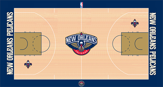
Um, yay? I guess?
It certainly does feature the New Orleans Pelicans' primary logo at half-court and two of its secondary logos, with the fearsome and very cool "Bird de Lis" and the also cool (if less so) "Crescent City Basketball" alternate. The gold paint in the key might look neat, too, although a closer look through the interactive 3-D court view available on the team's website makes it look a bit mustard-y.
The look's not bad or anything; it's just a bit blah for my taste, I guess, in terms of a redesign connected to a total brand overhaul. (Perhaps I've been spoiled by recent bonkers entries from the likes of the University of Central Florida, Cal and Florida International University.) Here's hoping for something a bit more exciting when the time comes for the Pellies to unveil the brand-new home and road uniforms that Anthony Davis, Jrue Holiday, Eric Gordon and company will rock during the 2013-14 season. No ETA on those yet, I'm afraid.
Then again, maybe I'm being a bit of a stick in the mud or harboring unreasonable expectations — what do you think of the new-look surface at the New Orleans Arena? Let us know in the comments below, on Facebook or on Twitter.
Hat-tip to Reddit's NBA page.
No comments:
Post a Comment